Dashboard filters are a way for InViewer users to dynamically filter the data to change visualizations in report widgets displayed in dashboards.
Below are the different filter types you may encounter:
Radio Button
The Radio filter type allows you to select individual values from a list, one at a time. Only one value at a time can be selected.
Checkbox
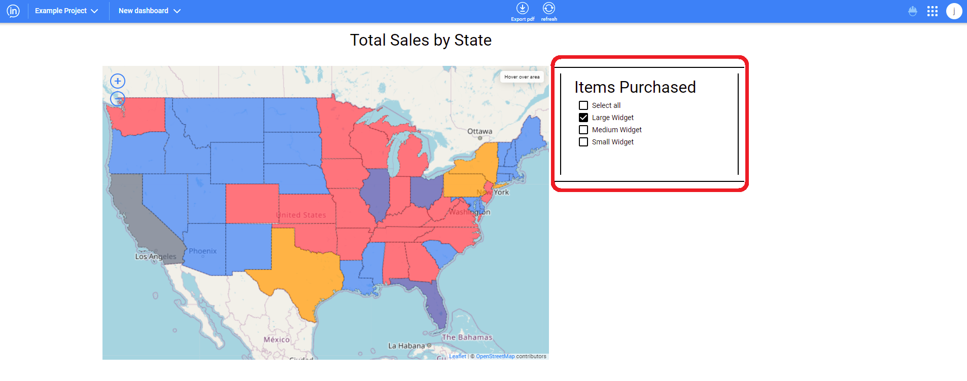
The Checkbox also lets you select values from a list, but you can select multiple values, Select All, or toggle to Unselect All.
Multiselect
The Multiselect filter is similar to the Checkbox. The Multiselect is useful when there are multiple, even hundreds of selectable values for the user to choose from to filter by. Rather than occupy screen space showing all of the choices, the Multiselect shows these via a simple drop-down, and then only displays the selected items.
The Multiselect also allows you to quickly search among hundreds of filter choices by typing the first few letters of the value you’re seeking, it’s like a filter within a filter!
Slider
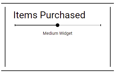
The slider functions by clicking an dragging the dot along the slider line to make different selections. It is commonly used for picking different time periods to show how data looked for each of them, or two can be used to set a start date and the other the end date to create ranges.
Text
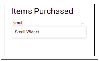
The text variation of the prompt filter allows the user to type in the feature that they would like to filter to. An example is below. It also can auto-complete partial text strings and can generate a list that lets the user select an option.
Date Picker
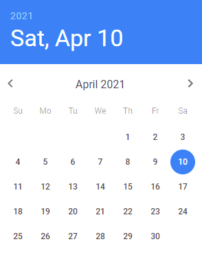
The date picker prompt filter lets the user pick out a date from on a calendar view. See below for an example of one of these calendars. Multiple date pickers may also be used to select a date range.
